A real example: two Metro Detroit contractor homepages
Two contractors around here are running Facebook ads right now:
- A Westland mason whose ad link goes to a "Website not found" page.
- A Commerce Township kitchen remodeler on a free-builder web address, with about 125 words on the whole homepage.
I rebuilt both homepages using only the facts already on their own Facebook pages, plus the 13 rules. These are mockups I made on my own. They aren't my clients and didn't ask for this, so I hid their names, phone numbers and web addresses.
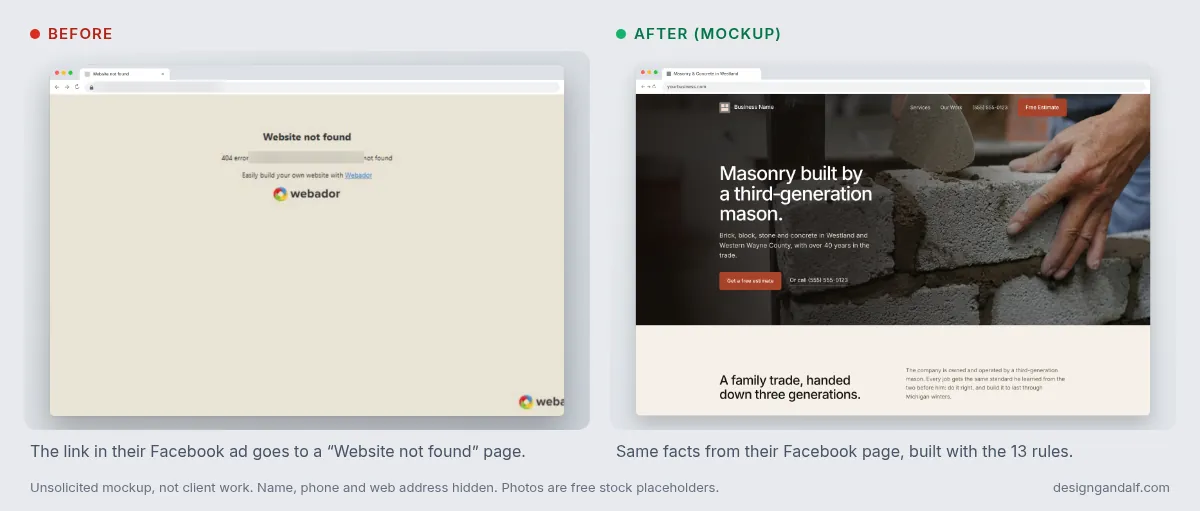
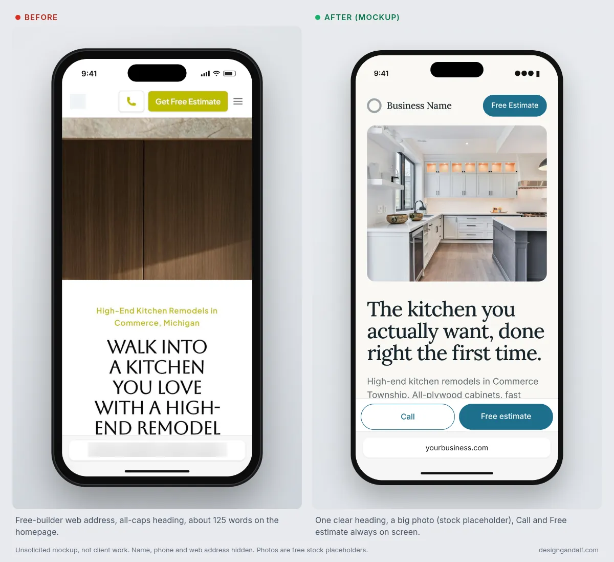
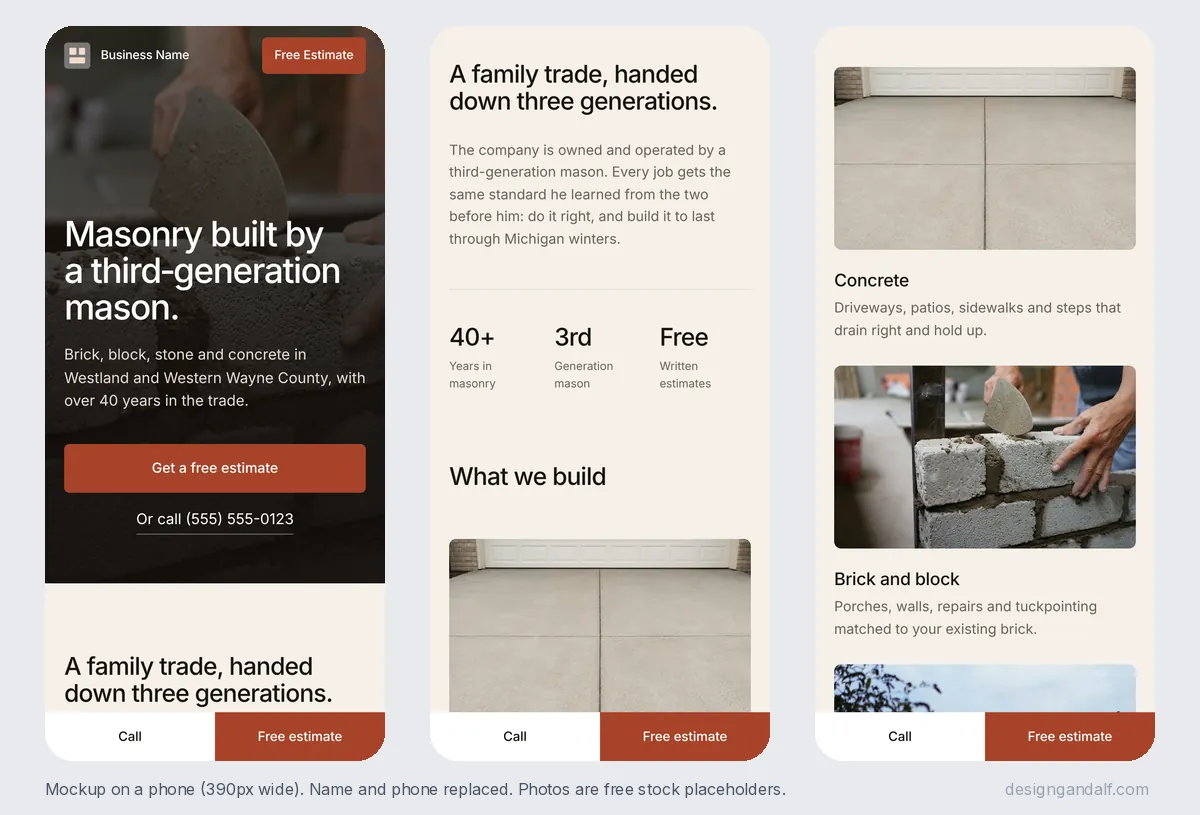
Full honesty: the photos in both mockups are free stock photos I used as placeholders. A real site should use the contractor's own job photos. That's rule 13, and it matters more than any of the other 12.
The 13 rules, in plain English
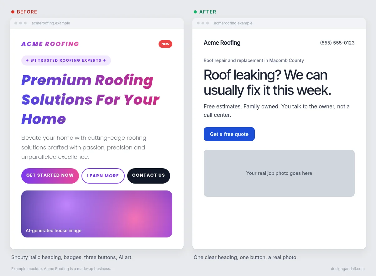
Each rule has a before and after. The made-up business in these examples is Acme Roofing, so nobody gets picked on. The picture at the top of this post shows most of them at once.
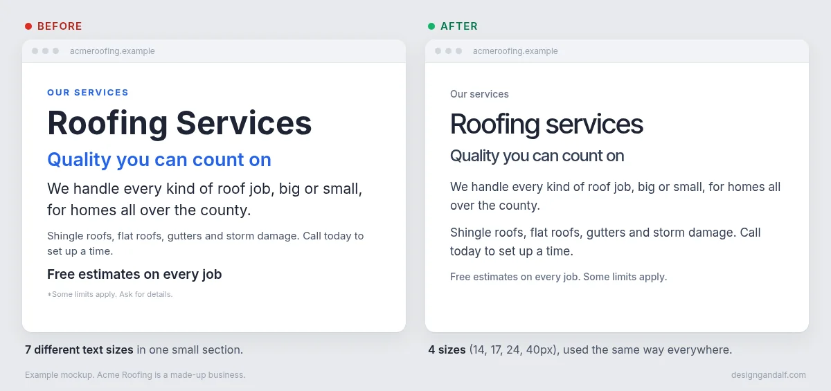
1. Use a small, consistent type scale
Pick 4 or 5 text sizes and use them everywhere. AI tools tend to invent a new size for almost every line, so the page looks messy even when the words are good.
Before: 7 different text sizes in one small section. After: 4 sizes (14, 17, 24 and 40px).
2. Make card titles smaller than section headings
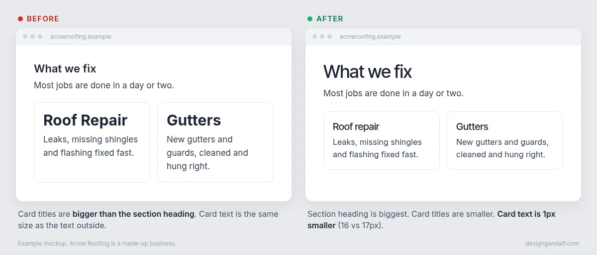
The section heading is the boss. The cards under it (services, steps, FAQs) should have smaller titles. When card titles are bigger, the page has no clear order and people's eyes bounce around.
Before: "Roof Repair" in a card is bigger than "What we fix" above it. After: the section heading leads and the cards follow.
3. Use 400 for body text and 400 or 500 for headings
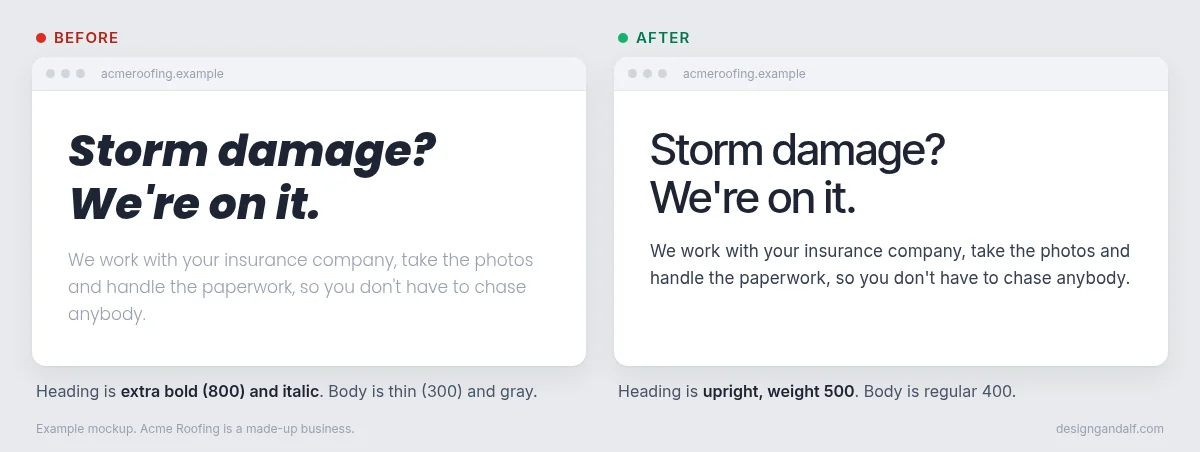
Those numbers are font weight. 400 is regular and 500 is medium. Big headings are already big, so they don't need to be extra bold too. Thin, light gray body text is hard to read, especially for older customers on a phone.
4. Keep headings upright. Skip italics
Slanted, extra-bold headings are one of the quickest signs a site came straight out of an AI tool. Upright headings look calm and confident.
Before: 800 weight, italic heading and thin gray text. After: upright 500 heading and regular 400 text.
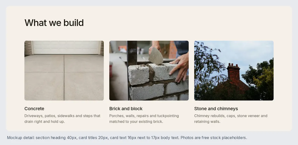
5. Size card text 1px smaller than similar text outside
If your normal paragraphs are 17px, make paragraphs inside cards 16px. It sounds tiny. It's the kind of detail people never notice on purpose, but it makes a page feel put together. You can see it in the cards above, and in the mason mockup:
6. Size button text 1px smaller than nearby text
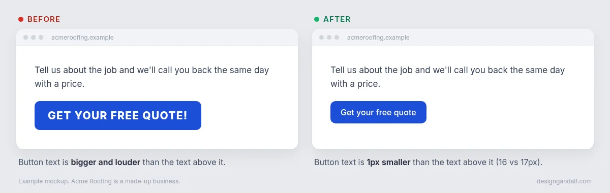
A button already stands out because of its color. If the text is also bigger, bolder and in all caps, it yells. Make it 1px smaller than the text around it and let the color do the work.
Before: "GET YOUR FREE QUOTE!" in big bold caps. After: "Get your free quote" at 16px under 17px text.
7. Tighten letter spacing as type gets bigger
Default letter spacing is made for small text. On a big heading it looks loose, so pull the letters a little closer together. Small text stays at normal spacing.
8. Use tight line height for large headings
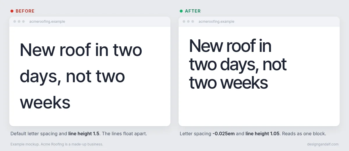
Line height is the space between lines. Body text needs room (about 1.6). Big headings need much less (about 1.05 to 1.1), or the lines float apart and stop reading like one sentence.
Before: normal spacing and line height 1.5. After: letter spacing -0.025em and line height 1.05.
9. Leave breathing room between sections
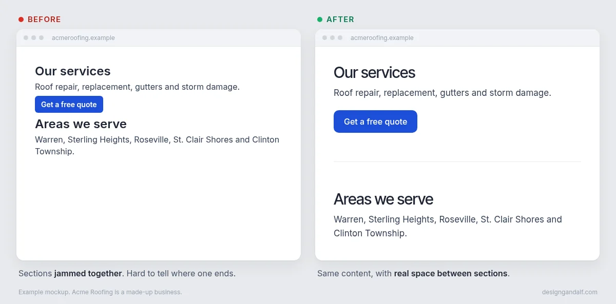
Give each section real space above and below. The mockups above use 128px on a computer and 80px on a phone. Empty space isn't wasted. It shows people where one idea ends and the next one starts.
Before: sections stacked right on top of each other. After: the same content with room to breathe.
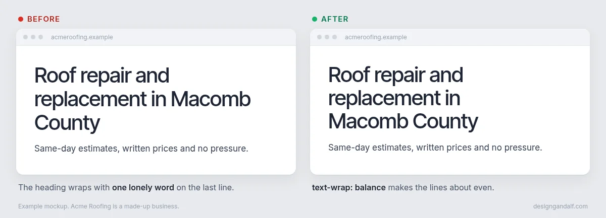
10. Balance wrapped headings. Avoid lone words on the last line
When a heading wraps onto two or three lines, the lines should be about the same length. One word hanging alone on the last line looks like a mistake. One line of CSS fixes it (it's in the code box below).
Before: "County" alone on the last line. After: three even lines.
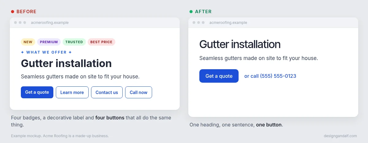
11. Cut decorative labels, badges, and redundant buttons
"NEW," "PREMIUM" and "TRUSTED" badges, sparkly little labels above every heading, and four buttons that all go to the same contact form. Cut them. One clear button per section is plenty, plus your phone number.
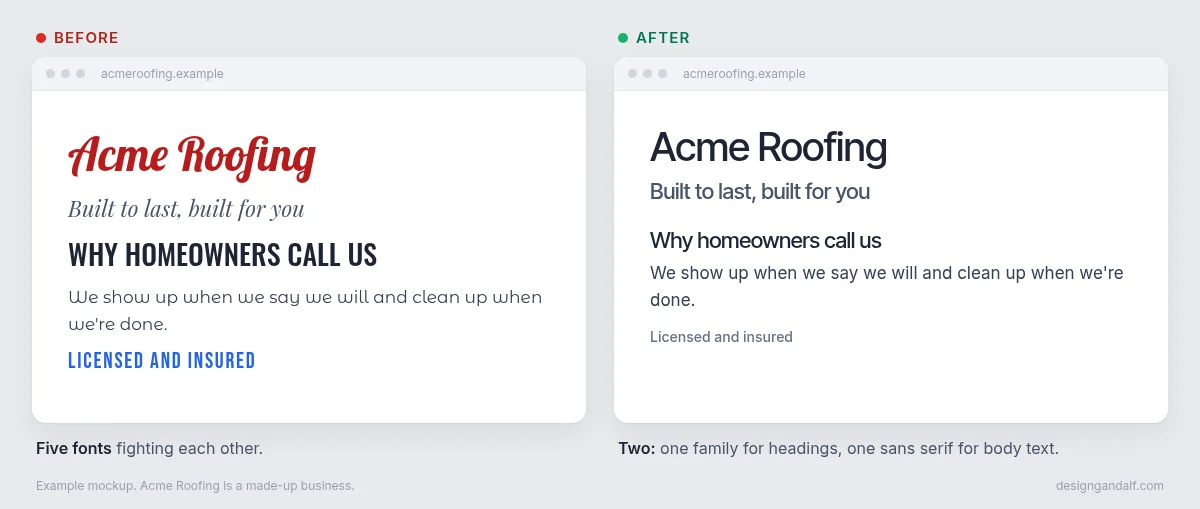
12. Use one sans serif for body text and one family for all headings
Pick one plain font for your paragraphs (Inter is a safe choice) and one font for every heading. They can be the same font. The mason mockup uses Inter for everything. The remodeler mockup uses a serif for headings and Inter for the rest. Five fonts on one page looks like a ransom note.
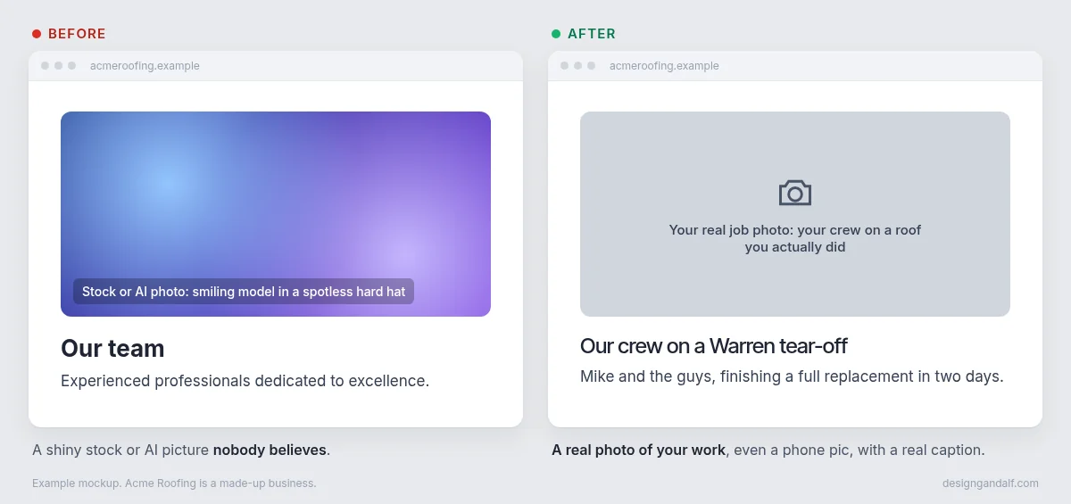
13. Favor high-quality, real photos
Use photos of your actual work. A decent phone picture of your crew on a real job beats a perfect stock photo, because customers can tell. AI-generated people and houses are even worse.
Like I said above, my two mockups use free stock photos because I don't have those contractors' pictures. If either of them wanted the real thing, the first thing I'd ask for is their job photos.
The CSS behind a few of these
If you or your AI are editing code, this is what rules 3 through 8 and rule 10 look like. Change the sizes to fit your site.
/* Rules 7 and 8: bigger text gets tighter letters and lines */
h1 { font-size: 60px; letter-spacing: -0.03em; line-height: 1.05; }
h2 { font-size: 40px; letter-spacing: -0.025em; line-height: 1.1; }
h3 { font-size: 20px; letter-spacing: -0.01em; line-height: 1.3; }

/* Rules 3 and 4: regular body text, medium upright headings */
body { font-weight: 400; line-height: 1.6; }
h1, h2, h3 { font-weight: 500; font-style: normal; }

/* Rule 10: no lone word on the last line */
h1, h2, h3 { text-wrap: balance; }

/* Rules 5 and 6: cards and buttons 1px smaller */
body { font-size: 17px; }
.card p, .button { font-size: 16px; }
The prompts I used
Copy these into Claude, ChatGPT, Grok or whatever AI builder you use. Fill in the green parts.
Prompt 1 gathers the facts. This is the step people skip, and it's why so many AI sites are full of made-up reviews and "award-winning" claims. Make the AI work from real facts only.
Here is a local contractor's Facebook page and current website. Pull out only real facts I can use on a homepage: business name, trade, city, service area, phone, address, hours, years in business, what makes them different, and the services they list. Don't invent reviews, awards, licenses or numbers. If something isn't stated, leave it out.
Prompt 2 builds the homepage with all 13 rules included.
Build a single-file HTML homepage for [BUSINESS] in [CITY] using only these facts: [PASTE FACTS]. It should look like a real, premium local contractor site, not a template.

Sections: header with logo and Free Estimate button, full-photo hero with one clear headline, an intro with 3 real facts, services with photos, a recent work gallery, a free estimate form, service area, FAQ, and footer. On phones, add a sticky Call / Free Estimate bar.

Follow these 13 rules:
1. Use a small, consistent type scale.
2. Make card titles smaller than section headings.
3. Use 400 for body text and 400 or 500 for headings.
4. Keep headings upright. Skip italics.
5. Size card text 1px smaller than similar text outside.
6. Size button text 1px smaller than nearby text.
7. Tighten letter spacing as type gets bigger.
8. Use tight line height for large headings.
9. Leave breathing room between sections.
10. Balance wrapped headings. Avoid lone words on the last line.
11. Cut decorative labels, badges, and redundant buttons.
12. Use one sans serif for body text and one family for all headings.
13. Favor high-quality, real photos.
Already have a site? Use this one instead to clean up what you've got.
Here is my website: [YOUR LINK OR PASTE YOUR CODE]

Clean up the design using the 13 rules below. Don't change my words, prices, phone number or services. Don't add reviews, badges, awards or numbers I didn't give you. Tell me what you changed.

1. Use a small, consistent type scale.
2. Make card titles smaller than section headings.
3. Use 400 for body text and 400 or 500 for headings.
4. Keep headings upright. Skip italics.
5. Size card text 1px smaller than similar text outside.
6. Size button text 1px smaller than nearby text.
7. Tighten letter spacing as type gets bigger.
8. Use tight line height for large headings.
9. Leave breathing room between sections.
10. Balance wrapped headings. Avoid lone words on the last line.
11. Cut decorative labels, badges, and redundant buttons.
12. Use one sans serif for body text and one family for all headings.
13. Favor high-quality, real photos.
Check before it goes live: open the site on your phone. Make sure your phone number, prices and services are right, and that nothing was made up.
Rather not fiddle with it?
I'm Danny, a web designer in Metro Detroit. I build contractor websites for $0 down and $175 a month, with your real photos and unlimited edits. Want something changed? Text me and I change it. Tell me about your business and I'll call you back, or call me at (313) 801-7388.
Tell me about your business